


God-tier branding: the aesthetic revival of religion
Finding meaning in church pews, festivals and supermarket aisles

This is probably revealing too much about my particular algorithm, but TikTok is heavy on the Catholic core for me right now. People dressed in what are essentially christening gowns, standing in front of dripping altar candles and reciting Gregorian chants (Q: how flammable is lace?).

A spiritual remix
Apparently Gen Z is keeping the faith. Monthly church attendance among 18-24 year-olds has quadrupled from 4 per cent to 16 per cent. Something is shifting and it’s both spiritual and aesthetic. Where millennials actively shook off religious identity – often with an eye-roll – many Gen Zers are reimagining it. Not the Songs of Praise stiffness. This new wave is hyper-curated, symbolic, semi-ironic. As much about personal expression as it is about belief.
Not all of it is soft-lit and candle-scented. There’s a darker thread. Some are being drawn to religion through ultra conservative influencers, who use Christianity to prop up ideas around gender roles and “traditional” values. But that’s only one part of the picture.
The shift is also about something more human – a desire for structure, for meaning, for an anchor. In a world that feels chaotic, faith – in some form – offers a framework. And a real community – not a group of people who like a certain brand of t-shirts.
Carolyn McMurray, a young copywriter and founder of the Word Tonic community and Christian said: “There’s always been something shit happening in the world. In every generation we’re trying to find ourselves and there’s different ways to express that through art, through career, through faith.”
Maybe that’s what we’re really seeing. Not a religious revival in the traditional sense, but a remix. A return to ritual, with new packaging that fits the feed, the aesthetic and the times.
Fonts with fear of God
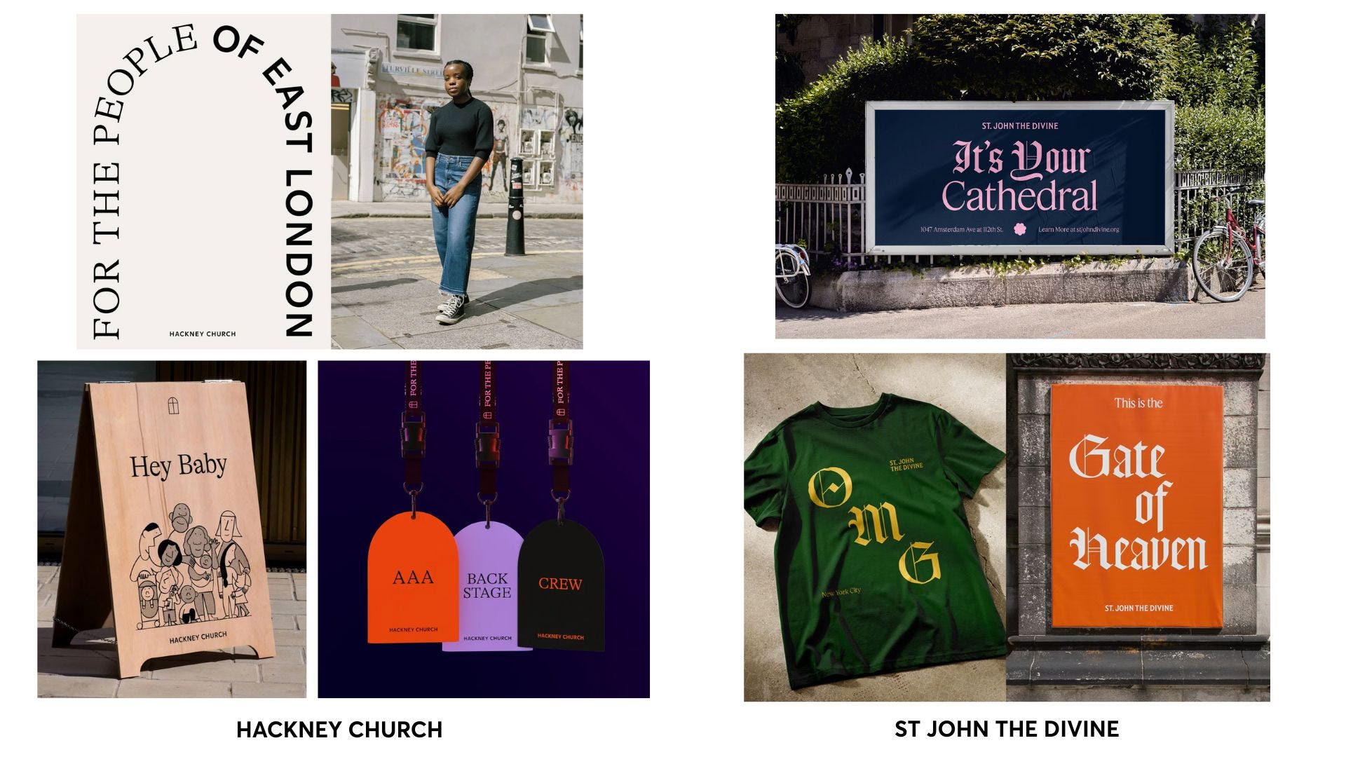
This new wrapper on religion means someone like Hackney Church can have an identity that reminds you of “Depop, or a Glossier-style cosmetics brand” as Creative Review wrote. A few years ago, our friends at OMSE worked on the rebrand and studio founder James Kape said their brief was reinvigoration: “The Church of England was in decline. Attendance was falling. Many of Hackney’s churches were underfunded, under-visited.” Their strategic answer was to create not just a church but a cathedral of creativity: “Can you be more than a church and think of ways to be more innovative?” The design they created was modern, minimal and bold with outputs that spanned a cafe and a collection of craft beer. Monks drank beer, after all.
And then earlier this year The Cathedral of St. John the Divine in New York took a different approach. It leant into its religious heritage, with a new identity drew from archival printings of The Book of Common Prayer, using gothic typography with unapologetic reverence. The result is almost jarring – Old Testament fonts used to express things like “OMG” – a design decision that feels kind of sacred, kind of sacrilegious.
A new language of belief
The shift goes beyond traditional religion. Carolyn says many of the 2,500 copywriters in her community are turning to spirituality in other forms – tarot cards, astrology, therapy-like rituals.
And brands are borrowing the symbols. Using spirituality and religion as inspiration for the way they look, speak and behave. Here are a few that have caught our eyes.
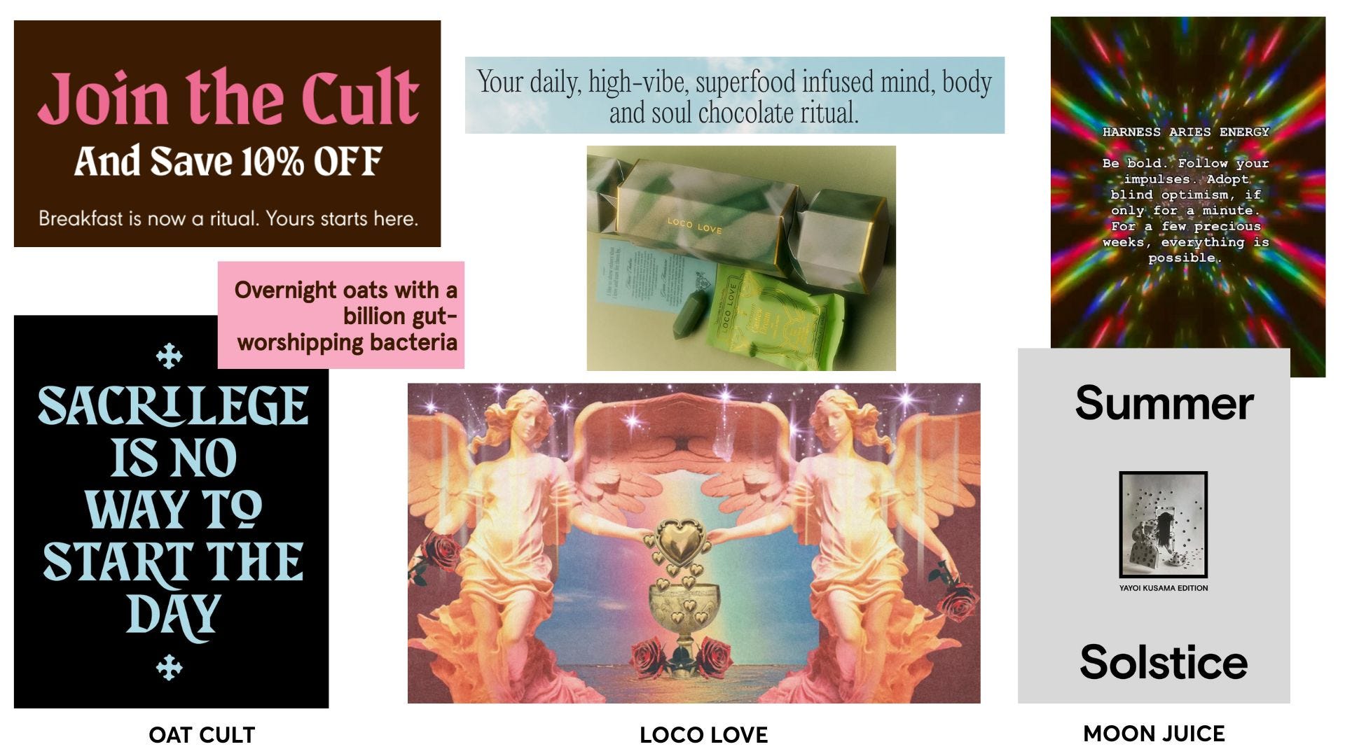
Food as Faith
Not content with just tasting good, these brands ask to be believed in. Devotion, worship, transformation – it's all on the label, and on your breakfast table.
Oat Cult (clue’s in the name) leans into the idea of food as a belief system. Devotional phrases like “gut-worshipping oats” “no sacrifice” “devote yourself to flavour” echo spiritual fervour in a tongue-in-cheek way. “Sacrilege is no way to start the day”.
Loco Love casts chocolate as cosmic medicine. Their “high vibe” truffles are infused with adaptogens and aphrodisiacs, wrapped in language that blends romance and ritual. And their chakra bon bons exist to “banish boring surface level convos and to invite storytelling.” A mission we can get behind.
Moon Juice feels like Silicon Valley stardust – a brand where wellness, witchcraft and biohacking collide. Products have names like “Spirit Dust” and “Sex Dust,” sold a kind of breathy, elemental mysticism. Leans into star signs and solstice as content strategy.
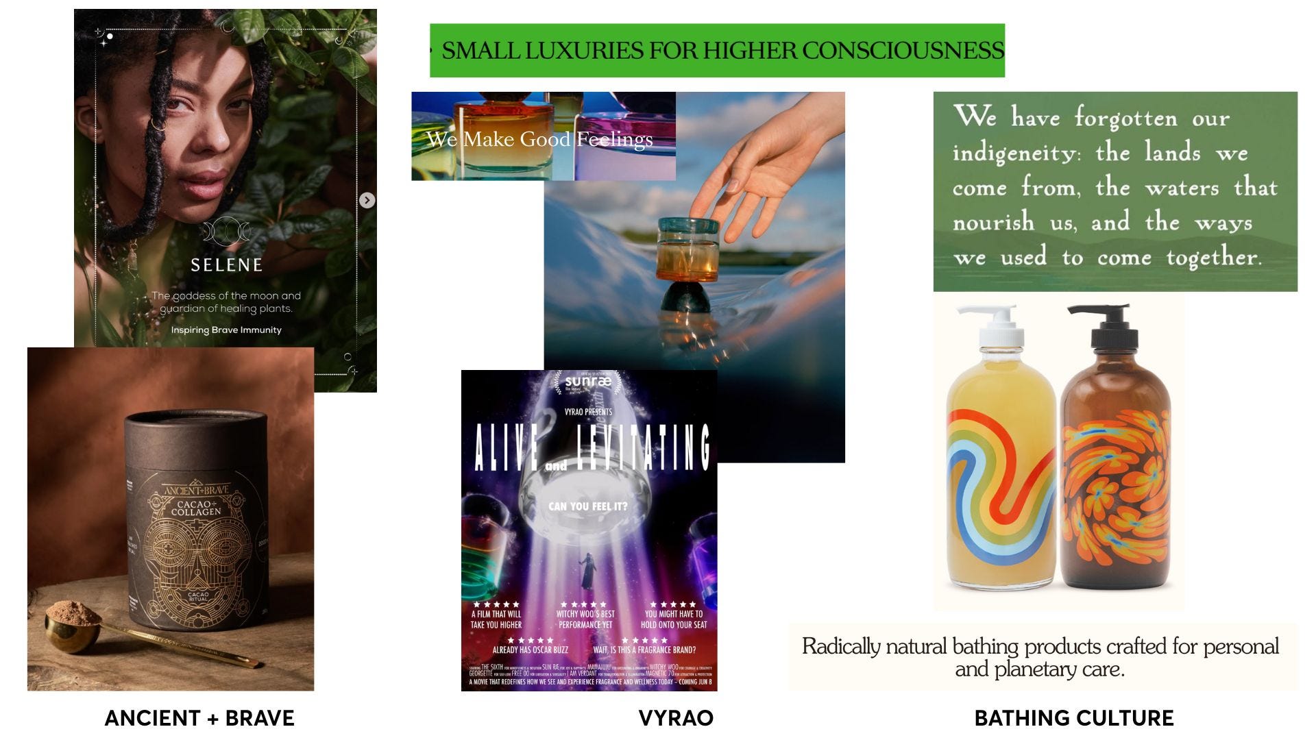
Rituals Rebranded
From scent to supplements to soap, the ordinary gets recast as sacred. These brands turn daily routines into ceremonial acts.
Ancient + Brave feels like a cross between a stoic wellness monk and a 21st-century priestess of longevity. Wellness rituals are reframed as sacred ceremonies. Packaging like altar objects. Tinctures names after goddesses.
Vyrao by Yasmin Sewell fuses fragrance with energy healing and feels both spiritual and witchy. Its perfumes aren’t scents, they’re positioned as vibrational tools. The language of frequency, intention and transformation is everywhere, with product names like “Witchy Woo,” “I Am Verdant,” and “Free 00.”
Bathing Culture makes soap feel spiritual. Their branding borrows from baptism and back-to-the-land nostalgia, with bottles that look like 70s psychedelic hymnals. “Bathing is a return. To self. To nature. To something shared. A quiet ritual that connects us across identity and origin. Immigrant or native. Seen or seeking. You are worthy of that return”.
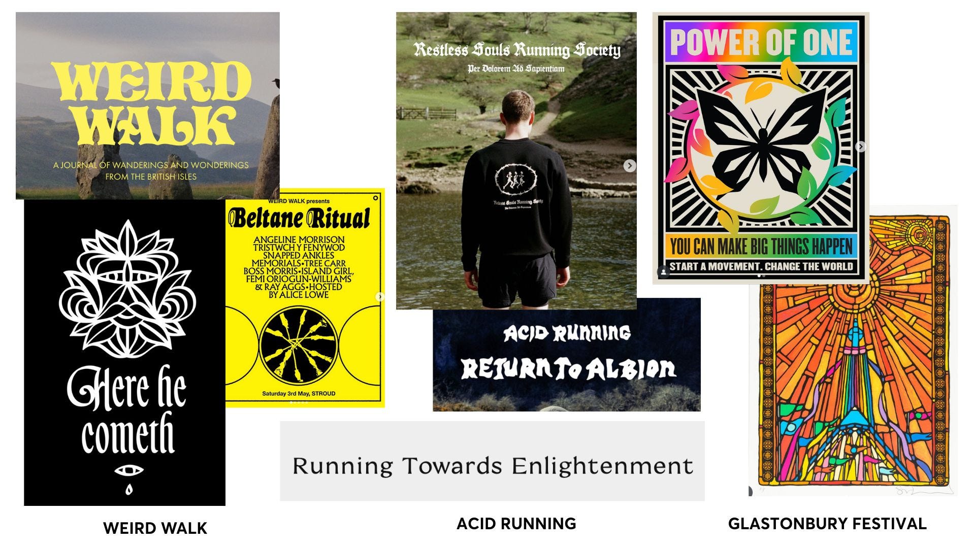
The Mythic Revival
Ancient symbols, pagan folklore, ley lines. These brands tap into the mythic past to offer a new kind of meaning – less institution, more intuition.
Weird Walk revives ancient folklore through the lens of zines, rambles and pagan aesthetics. It’s more ley lines than lifestyle, but still taps into a shared hunger for mystery, myth, and meaning.
Acid Running positions running as a devotional movement or pleasure and pain. Elevated consciousness runs through their collection descriptions: “Voluntary discomfort: Our first collection pays homage to the ancient principles of stoicism, whose noble tenets have inspired runners in their darkest moments for centuries”. Sublime.
Glastonbury Festival is the reason your feed was likely full of “happiest place on earth” captions this week, bonus points if you spotted a reference to ley lines. This year the festival released artworks inspired by stained glass windows: “reimagined for a world with no gods but the natural world and the beauty of the sun”. Quite, well… churchy.
It’s crude to compare someone’s spirituality to an overnight oats brand positioning on worship and devotion. Real spiritual practice is about making life feel meaningful. Brand positioning, ultimately, is about commercial gain. But there are overlaps – in the language, in the search for identity, in the desire to belong.
At Sonder & Tell, we often say that brands want what religion has. (We reference Amanda Montell’s Cultish on a near-weekly basis.) They want devotion. They want followers. They want to inspire, to convert, to gather you under a single idea.
In a time when we’re all looking for meaning – for markers, rituals, community – maybe it’s not so surprising. You might still find it in a pew. Or maybe, just maybe, you’ll find it in a supermarket aisle.
The Prompt
Take a piece of brand copy – something you’ve seen on-pack, in an ad, or even on your own homepage – and dial up the devotion. What happens if you treat it like a sacred text? A religious manifesto, a spell, a psalm.
Can you make “hydrates the skin” sound like a spiritual awakening? Can you turn “next-day delivery” into prophecy?
The Vortex
Amanda Montell’s Cultish is heavily referenced at S&T. “Words are the medium through which belief systems are manufactured, nurtured, and reinforced, their fanaticism fundamentally could not exist without them.”
From neon tote bags to gothic type: how designers are helping churches look (and feel) culturally alive again.
Jessica White hopes young people are flocking to church for the right reasons.