

Words paint a thousand pictures
Like colour, like voice, you don’t have to be monotone.

Ancient Egyptians knew it when they sunbathed in solariums of coloured glass to cure ailments. And you’ve probably felt it, hesitating at a red sign or getting stoked with the burning-orange sunset. Colour affects us physically and emotionally. Different shades give us different feelings... and that’s colour psychology in a nutshell. In brand, designers often work with it. And as writers, we can’t help but think brand voice can make more of it. Let’s rewind…
Colour psychology in branding, a quick primer
Okay, full transparency, there’s *scientific debate* around the certainty of colour psychology – I mean, we all see colour through lenses of cultural and personal experiences. But generally, it’s agreed colours carry a kaleidoscope of messages and emotions, from grounding greens to I've-got-the-power purples.
That insight’s been harnessed across education, interior design (Lick lets you browse paint colours by mood), healthcare and art. Think of Picasso’s blue period, headstrong Scarlett O’Hara or Luke in his white tunic battling Darth (literally ‘dark’) Vader.
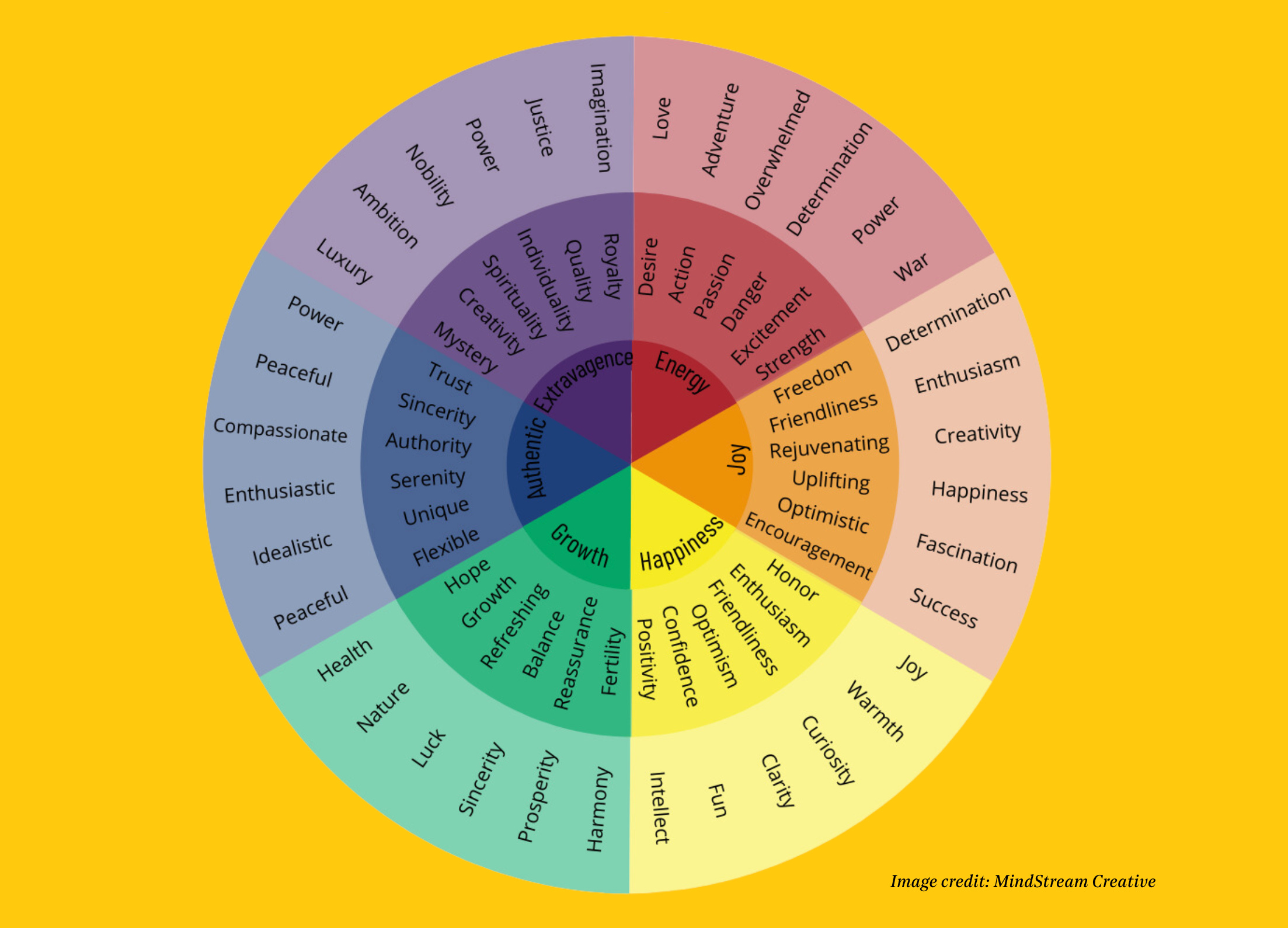
Of courseee, brands are in on it too; designers pick, harmonise and clash palettes in a way that mirrors the brand strategy. Picture trustworthy blue British Airways versus happy-go-lucky easyJet orange.
If colour stirs emotions, and emotions influence what we buy and who from, it figures: colour is a powerful marketing tool. So powerful it increases brand recognition by 80% and is the deciding factor in 9 in 10 spur-of-the-moment purchases. So powerful that many brands have trademarked their colours: Tiffany’s sophisticated robin-egg blue, reliable UPS brown and Post-It’s lightbulb-moment yellow.
Colour means business. But most of the chit-chat about it only has eyes for visuals – palettes, logos, icons, imagery – which is daft because (1) colour psychology is all about looking past what we see and (2) colour psychology can be a helpful tool for writers. Think about it: tone of voice. They might look black and white on a page, but words are colour. Like detail in a picture, they add dimension to a brand world, and work on the same spectrum of emotion.
Translating colour psychology into words
The language of colour isn’t about writing ‘blue’, ‘red’, or whatever synonym Power Thesaurus throws up. It’s *the vibe*. Like all-red Virgin Media dialling up energy and desire: ‘Are you ready to be moved?’ ‘Why stumble when you can soar?’ Or Good Pair Days, whose words and brand colour are peachy – with enthusiastic run-on sentences and uplifting wink-nods like ‘today’s good mood is sponsored by wine’.

Like colour, like voice, you don’t have to be monotone. Think in palettes. Harmonise. Contrast. Spotify dials up the edge with fresh green against savvy black, and a voice just as sharp. Apple’s pared-back silvery palette screams sleek and sophisticated with equally minimalist language: 'Light. Years ahead.' When we, Sonder & Tell, shook up Rude Health with the bright way to be healthy, its voice evolved with the same exuberance: pacey alliteration, onomatopoeia, plosives, playing on words. Flavours so bold you’ll fill your bowls to the brim.
So whether you’re evolving your brand voice, or simply sitting down to write, draw on colour psychology as a guide. What picture is this brand painting? How should it show up in the world? Look at Newton’s wheel: do I want harmony or the kind of contrast that makes sparks fly? Inject colour in your lines, and you'll grow the brand world beyond them.
The Advice
“Colour… can speak to the soul in a thousand different ways.”
— Oscar Wilde
The Interview

"[Blue-sky drinking] was real lightbulb moment for us. One of the reasons we approached Sonder & Tell was because we’d been struggling with who we are and what we are not. [It] gave our designer a strong basis for our visual identity. And, it does speak to how we want to approach the way we run the business. Everything we do, we want to have an eye on doing it left field."
Read the interview with Loah co-founder William here
The Brand

“When was the last time we danced? Yesterday.” It seems the no-alcohol category is all colour. With its bittersweet aperitivo, Botivo has built a brand world around ‘The Yellow Hour’ – clocked off, ready for something new. And its language is just as, well, yellow: optimistic, perspective-shifting, the warm lilt of a first-person voice. 0% ABV 100% pleasure.
The Prompt
Pick a colour or two and note the meaning from the wheel back at the top of this letter. Put 5 minutes on the clock. Now: write a story about your morning in a way that evokes that colour without ever mentioning it.
The Vortex
Read, Scroll, Listen
Look! Science! Why colour matters in marketing.
Write like a painter.
Montblanc pens, full Wes Anderson colour: we love this ad.
Step aside Chatroulette. Are you talking to a human or AI?
Poetry on prescription. Mind meets body meets great writing in this new permanent installation at Lush Oxford Street.